
My #1 author website design secret

I speak to many authors about their websites and one of the things that often crops up is their lack of confidence when it comes to making design decisions, especially when it comes to colour.
Should you go bold and bright to stand out? Or pick something softer and more muted so it feels approachable?
The choices can feel endless, and that’s exactly why so many authors stall at this stage.
But here’s the biggest design secret for authors, and it’s simpler than you might think.
Stick to a monochrome colour palette.
Keeping things simple and unified with one family of shades is the design approach that never fails.
It works across genres, highlights your books beautifully, and creates a professional look that feels timeless.
By monochrome, I don’t just mean black and white (although that’s a classic). You can also go for warm neutrals and off-whites, charcoal greys instead of black.
Sticking to this simple, timeless choice can transform your website into something that feels instantly stylish and professional, and most importantly of all - doesn’t compete with your book’s cover.
Let’s break down why this works so well, especially for authors.
1. It lets your words take center stage
As an author, your main job is to communicate through words. You’ve got your book blurbs, your bio, your blog posts, your newsletter sign-ups: all text-heavy content that needs to be read.
A loud, multicoloured website can distract from that. Visitors’ eyes jump to the brightest colour on the page, which often isn’t your carefully crafted text.
A monochrome palette, on the other hand, creates harmony. The design fades quietly into the background, so the words themselves are what stand out.
This doesn’t mean the site looks boring. Quite the opposite.
A restrained palette feels intentional and curated. Readers won’t think about the design as much as they’ll think about your writing, which is exactly how it should be.
2. It creates instant professionalism
Whether you’re traditionally published, self-published, or somewhere in between, readers are constantly making snap judgments about you online. When someone clicks onto your site, you want them to feel reassured: this is a serious author, I can trust them, I want to read their work.
A monochrome design does that almost immediately. It communicates polish and confidence. Think about the branding of luxury magazines, design studios, or high-end publishers. More often than not, they lean toward minimalist, monochrome visuals.
You don’t need to look corporate or cold. When your site feels sleek and pulled together, it tells visitors that you take your craft seriously.

3. It adapts effortlessly to every genre
Authors often worry that their website won’t reflect the genre they write in. Should a romance author use pink? Should a thriller author use red? What if you write across genres?
Monochrome solves all of that. It’s genre-neutral while still being flexible. A crime author might stick to black, white, and steel-grey for a dark, moody feel. A children’s author might use soft creams and warm beige for a friendly vibe. A fantasy author could go for off-white with a hint of deep purple or blue..
No matter your genre, a monochrome palette gives you room to reflect tone without locking you into a cliché.
4. It keeps the focus on your book covers
I always say that your book’s cover is the most important marketing asset you have!
And that cover already has its own strong colours and design.
Covers are professionally created to catch attention online and on bookstore shelves. If your website is also filled with competing colours, it can a) dilute the impact of the cover and/or b) end up clashing with it.
A monochrome background provides the perfect stage. Imagine your brightly designed book covers lined up against a sleek black-and-white site. They pop. They instantly become the stars of the show, which is exactly what you want.
Readers should never have to squint or scroll past visual noise to notice your books. Monochrome design ensures the covers shine.
5. It makes your site easy to maintain
One of the hidden struggles of running a website is consistency. If you’ve chosen a five-colour palette, you’ve now got to make sure you use them in the right places every time you add a page or update a section. It’s fiddly and time-consuming.
A monochrome palette simplifies everything. With just one main colour (and its lighter or darker variations), you don’t have to second-guess yourself. Every heading, background, or button will naturally fit with the overall look.
This makes future updates faster, and it reduces the chance that your site will look messy or dated as time goes on.
6. It improves accessibility and readability
Good design isn’t just about looks. It’s about making sure your site works for everyone.
Monochrome colour schemes tend to have stronger contrasts between text and background, which makes them easier to read.
Of course, you still need to pay attention to accessibility standards (for example, not putting light grey text on a white background). But as a rule, working within one colour family makes it easier to create clear, high-contrast combinations.
For readers who may be scanning your site on small screens, or who have visual impairments, this simplicity makes a huge difference.

On a budget but need an author website?
The DIY Author Website Course is just for you! →
7. It never goes out of style
Trends in web design come and go. Remember when every site had a giant parallax header? Or when everything was covered in gradients and shadows? If you chase those trends, you’ll end up redesigning your site every couple of years.
Monochrome, though, is timeless. It has worked for centuries in print design, and it continues to work beautifully online. When you keep things simple, you sidestep the risk of looking dated. That means your site investment lasts longer, and you don’t feel pressured to constantly redesign just to ‘keep up’.
8. It reflects your author brand
Even if you don’t think of yourself as a brand, the truth is that readers are always picking up cues about who you are and what you stand for.
A monochrome site often communicates clarity, confidence, and focus. It shows that you know your message and you don’t need flashy extras to prove it.
That doesn’t mean you can’t inject personality. Typography, photography, and layout all play a huge role in making your site feel ‘you’.
But when you combine those elements with a clean, monochrome palette, your brand feels strong and unmistakable.
Tips for making monochrome work
If you’re ready to go monochrome but not sure where to start, here are some practical tips:
Choose your main colour wisely. Black and white are classic, but you can also use soft greys, creams and other neutrals.
Use texture, not colour, for interest. Patterns, subtle gradients, and photography can add depth without breaking the palette.
Highlight sparingly. If you do want to go with one accent colour (say, a single call-to-action button in bright red), keep it consistent and minimal.
Lean on typography. Great fonts add personality and structure, so your site never feels bland.
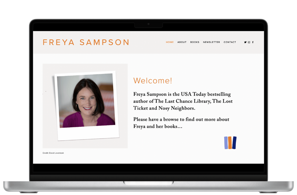
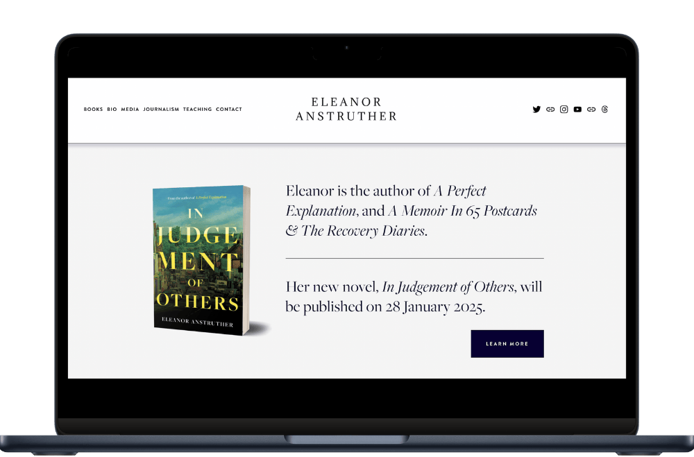
Examples of monochrome author websites (designed by me!)


Final thoughts
At the end of the day, your website’s job is simple: to showcase your books and give readers a clear, welcoming place to connect with you!
The truth is, design doesn’t have to be complicated to do that well.
The #1 author website design secret is this: keep your palette monochrome. It’s professional, timeless, easy to maintain, and it makes your book covers the star of the show. While trends come and go, this approach always works, and it will keep working, no matter how your writing career evolves.
So if you’ve been second-guessing your colour choices or endlessly tweaking your site, take a deep breath and strip it back.
Monochrome is the one design decision you’ll never regret.
Bonus tips: more beginner-friendly design practices for authors
Keep navigation simple. Stick to just a few clear menu items: Home, About, Books, Contact, so readers don’t get lost.
Use big, readable fonts. Prioritise legibility over style; body text should be comfortable to read on desktop and mobile.
Add plenty of white space. Don’t cram everything together. Give your words and images room to breathe.
Make your call-to-action clear. Whether it’s joining your mailing list or buying your latest book, make the next step obvious.
Check your site on mobile. Most readers will visit on their phone, so make sure it looks just as good (and works just as smoothly) there.
Don’t overload with widgets. Skip auto-playing music, cluttered sidebars, or anything that slows the page down. Clean always wins.
Feature your books up front. Place your latest release or series clearly on your homepage. Don't make readers hunt for it.

Save 10% off your first year’s Squarespace subscription using code CHARLOTTE10
More posts like this: